Block clock
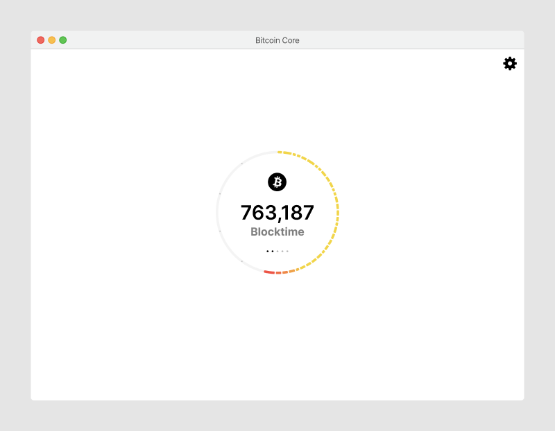
For the first version of the application, the block clock is the central part of the user experience. The application is focused on letting users easily run a node, and the block clock provides a simple visual to see the current status.
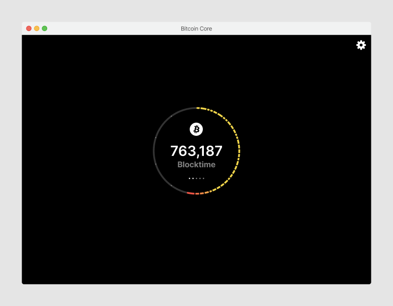
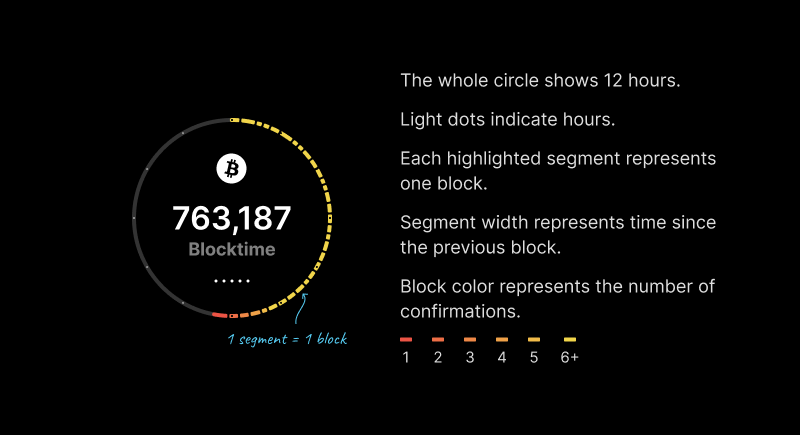
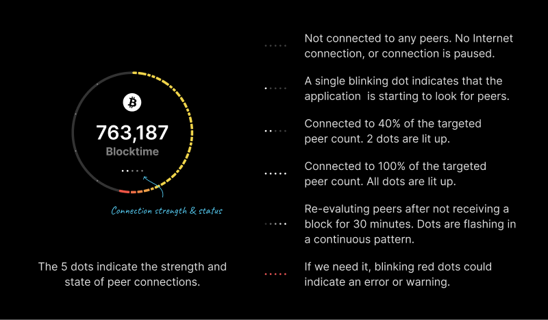
Every element in the block clock has a function. They can be combined to communicate different application states.
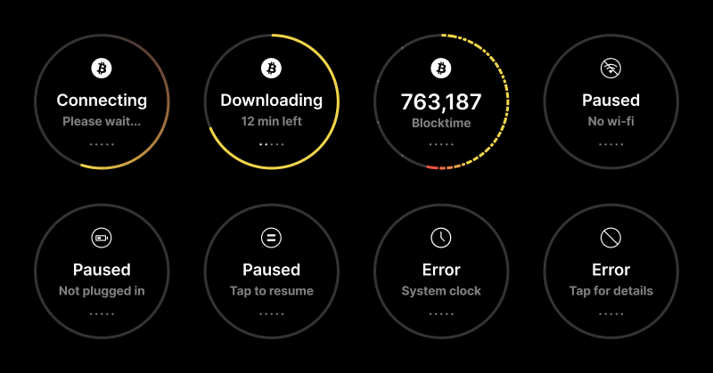
It takes some time until the application can show initial progress and a somewhat reliable time estimate until completion of the initial block download. To the user, this can look like the application is broken. So a few adjustments are made:
- The progress circle always shows at least a small bit (even at 0%)
- While the percentage value is typically rounded, we show tenths and hundredths below 1% so users can see some progress
- While the estimated time fluctuates drastically and provides not useful information, we only show “Estimating”
- A “~” indicates that this is an estimate
- We only show minutes when we’re confident that they are somewhat accurate

A network indicator appears below the block clock when the application does not run on mainnet. We need to decide whether this element should have a tool tip, and/or tapping it navigates to the settings for more information and options.

And the block clock in light mode, which simply switches the color variables from the dark set to the light set.
Layout logic
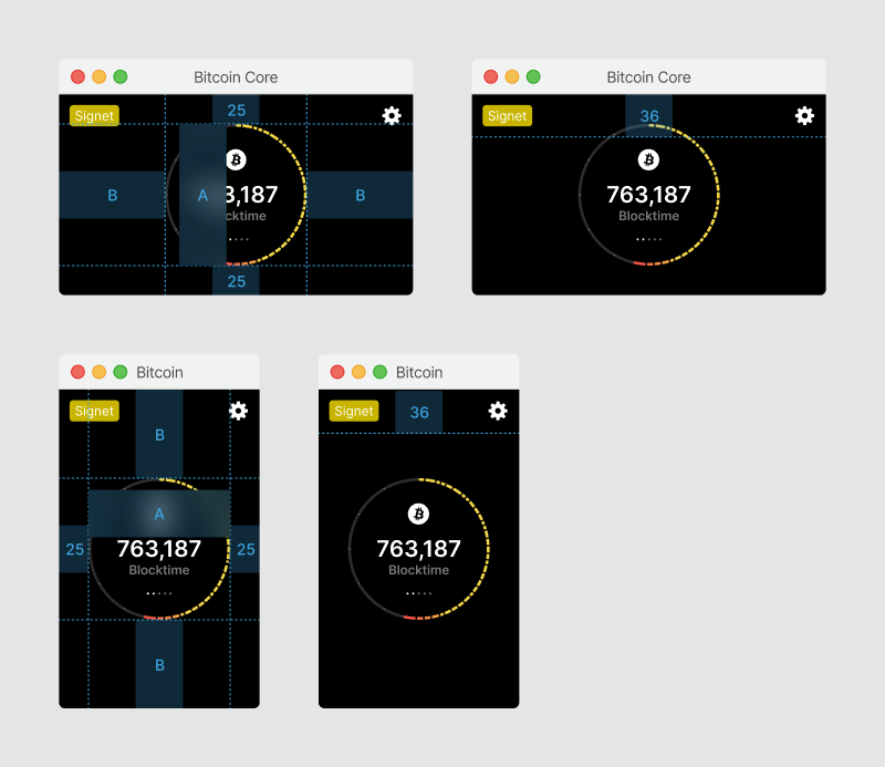
By default, the circular block clock is 200x200px in size, centered on the screen. The top bar is 46px tall and absolutely positioned.
When a network indicator is shown, the bounding box of the block clock and network indicator is used for centering within the window.
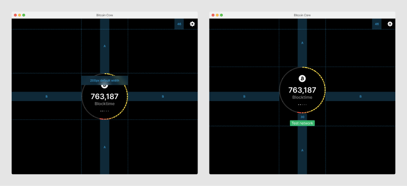
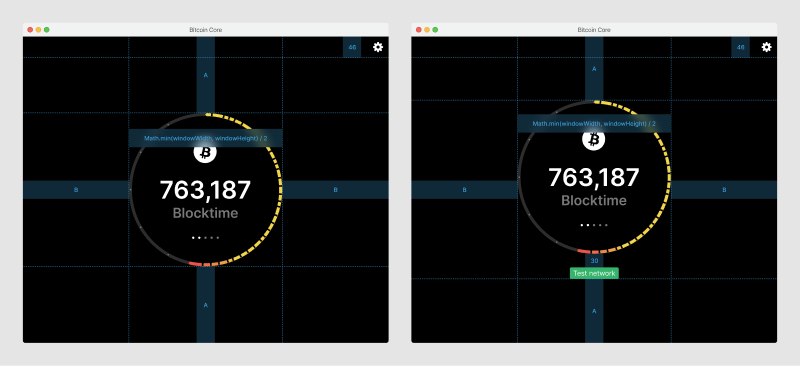
In showcase mode, the block clock tries to maintain 1/3 of the screen width or height, whichever value is smaller. It maintains a minimum size of 200x200px.
At smaller sizes (height < 400), the network indicator moves to the top-left corner of the window, making more room for the block clock, which tries to keep a size of 200x200px.
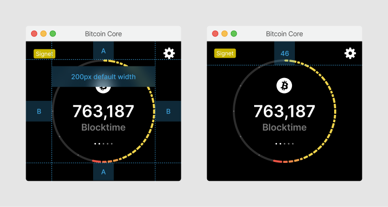
At even smaller sizes, the primary factor becomes a minimum side padding of 25px. The block clock shrinks smaller than it’s 200x200px default size. The top bar height shrinks to 36px.
Prototype
This web prototype was done to validate if the block clock dial renders well with realistic data (or if segments get too small), to explore animations & interactions, and test widgets.