Layout
The application layout is responsive to the window size, across both mobile and desktop. A set of simple rules is used to ensure broadly balanced layouts. The rules were intentionally kept very simple for the first designs and can be iterated on over time.
Rules include:
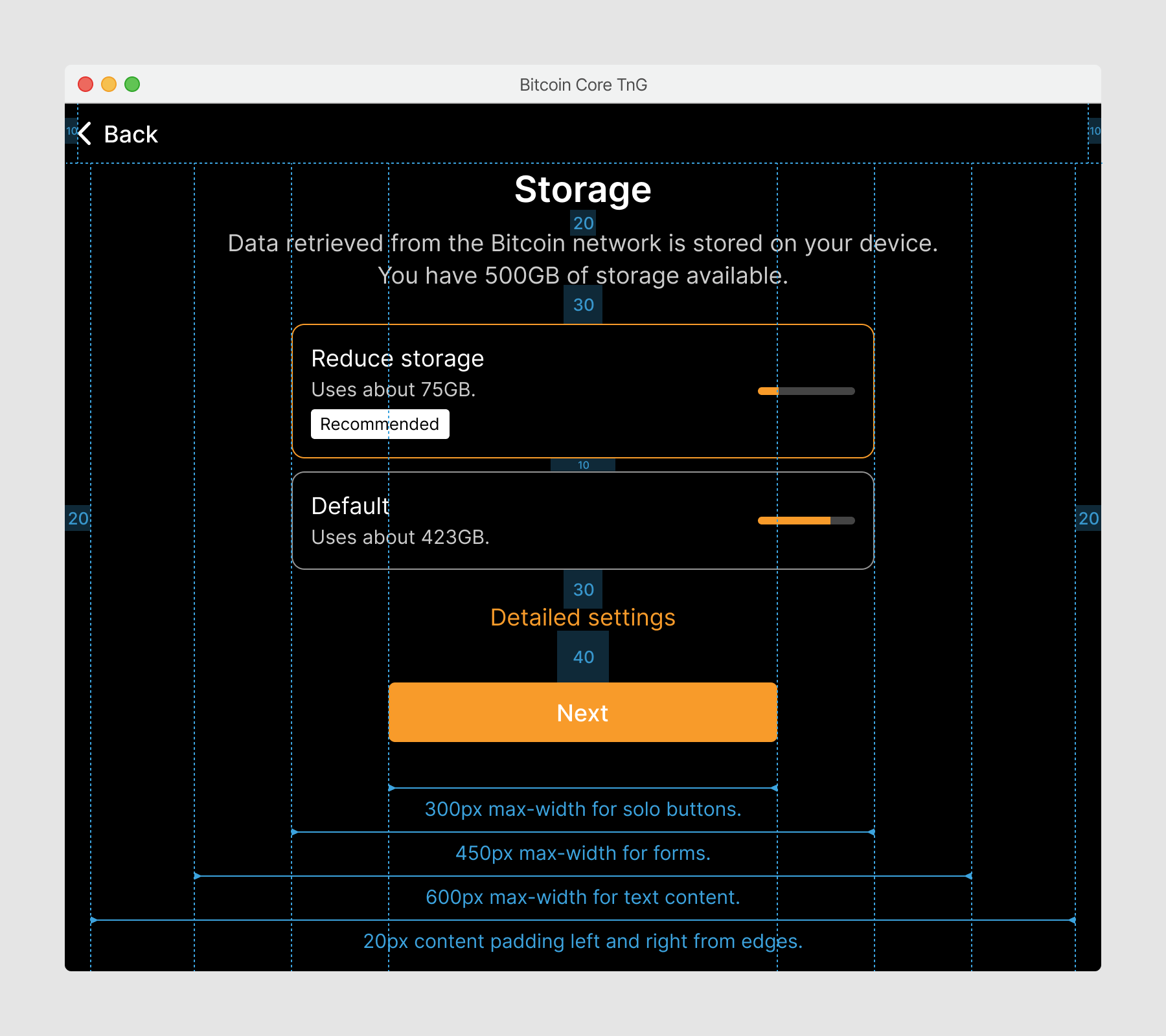
- Vertical spacing of content elements
- Horizontal padding of header and content areas
- 3 maximum widths for different content elements
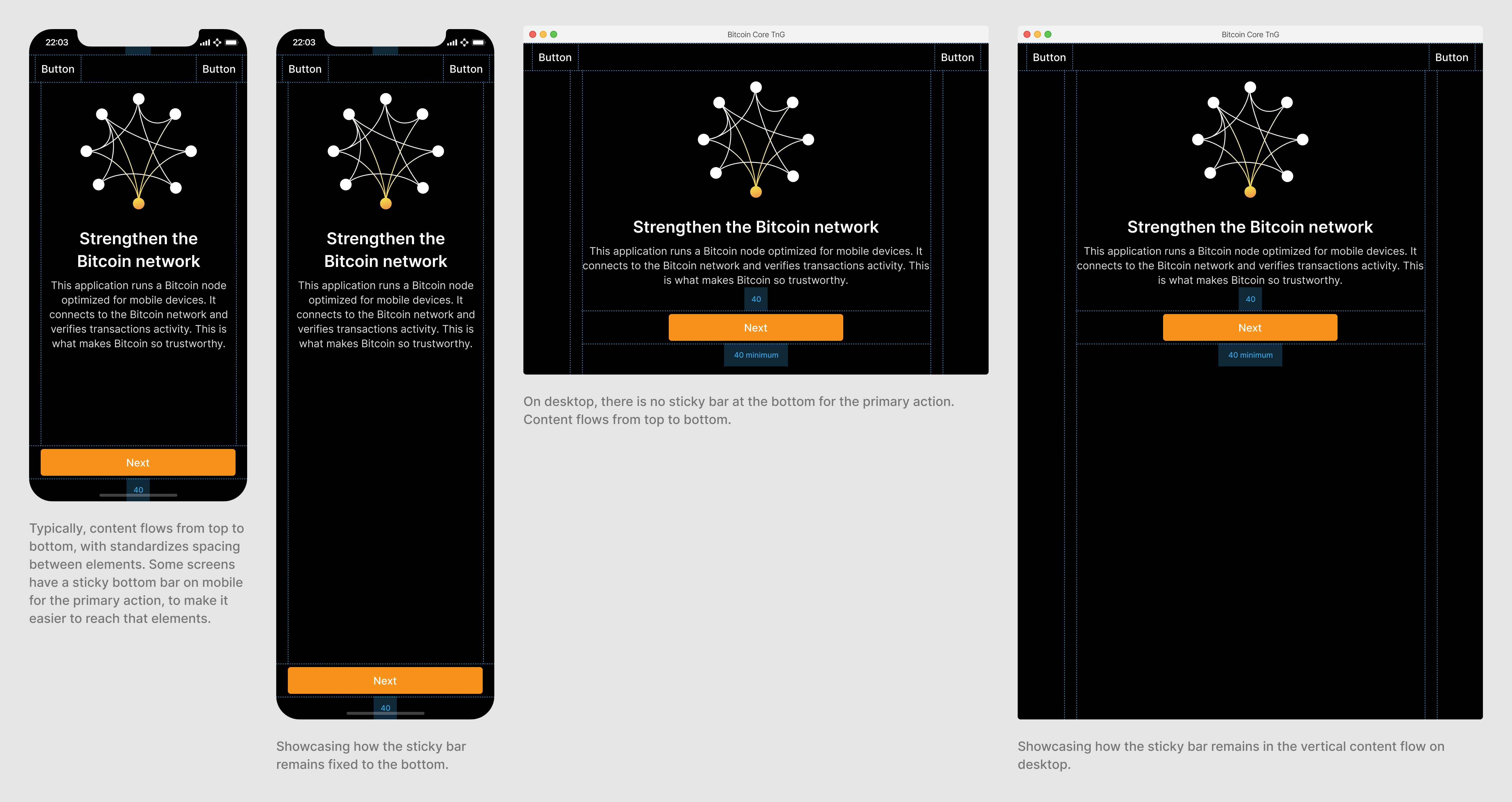
- A fixed bottom bar for primary actions on mobile
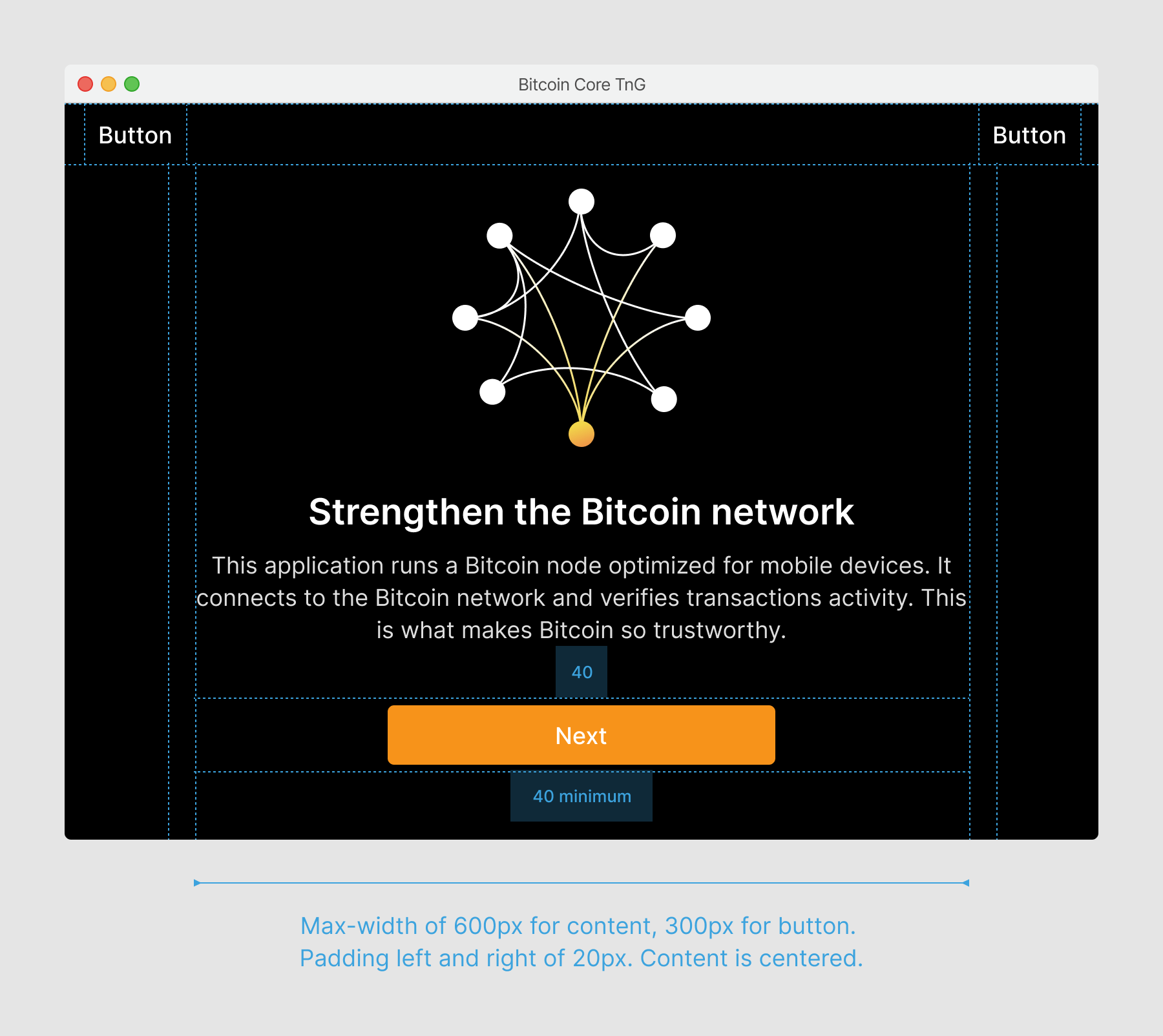
Rules for the 3 maximum content widths, as well as vertical spacing examples.
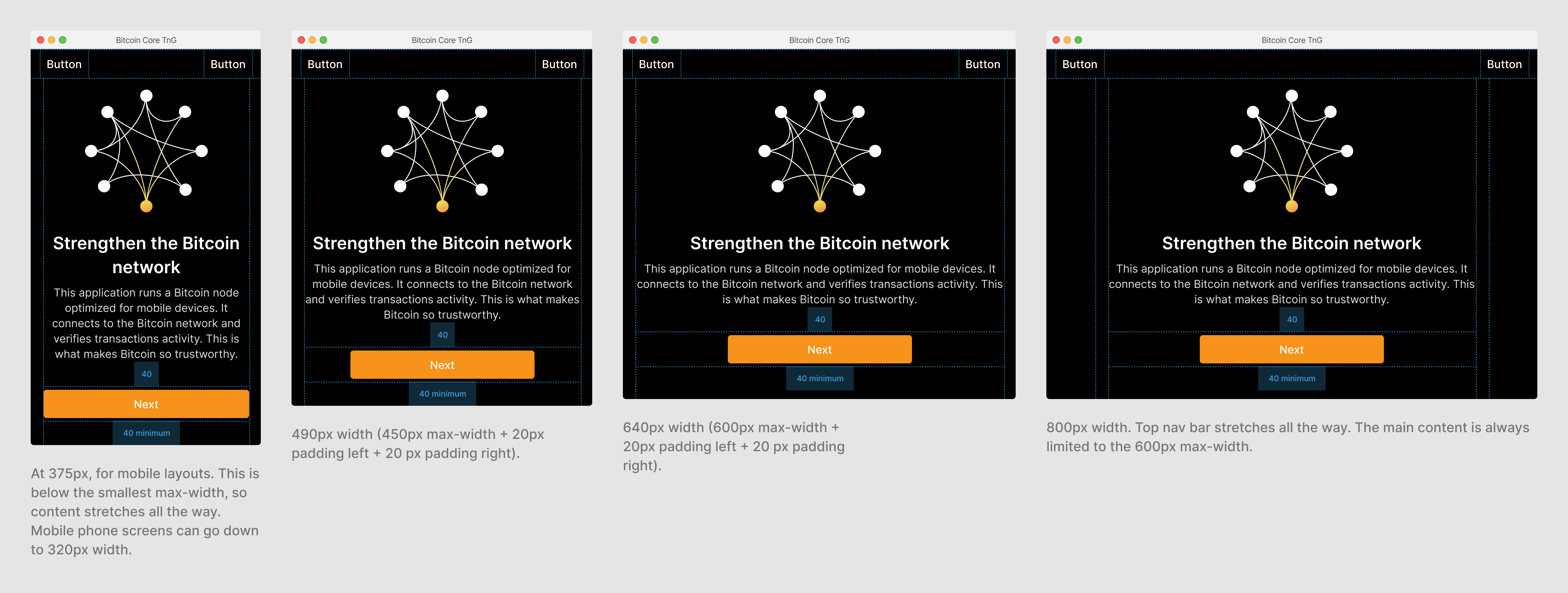
Examples of how the content adjusts based on window width.
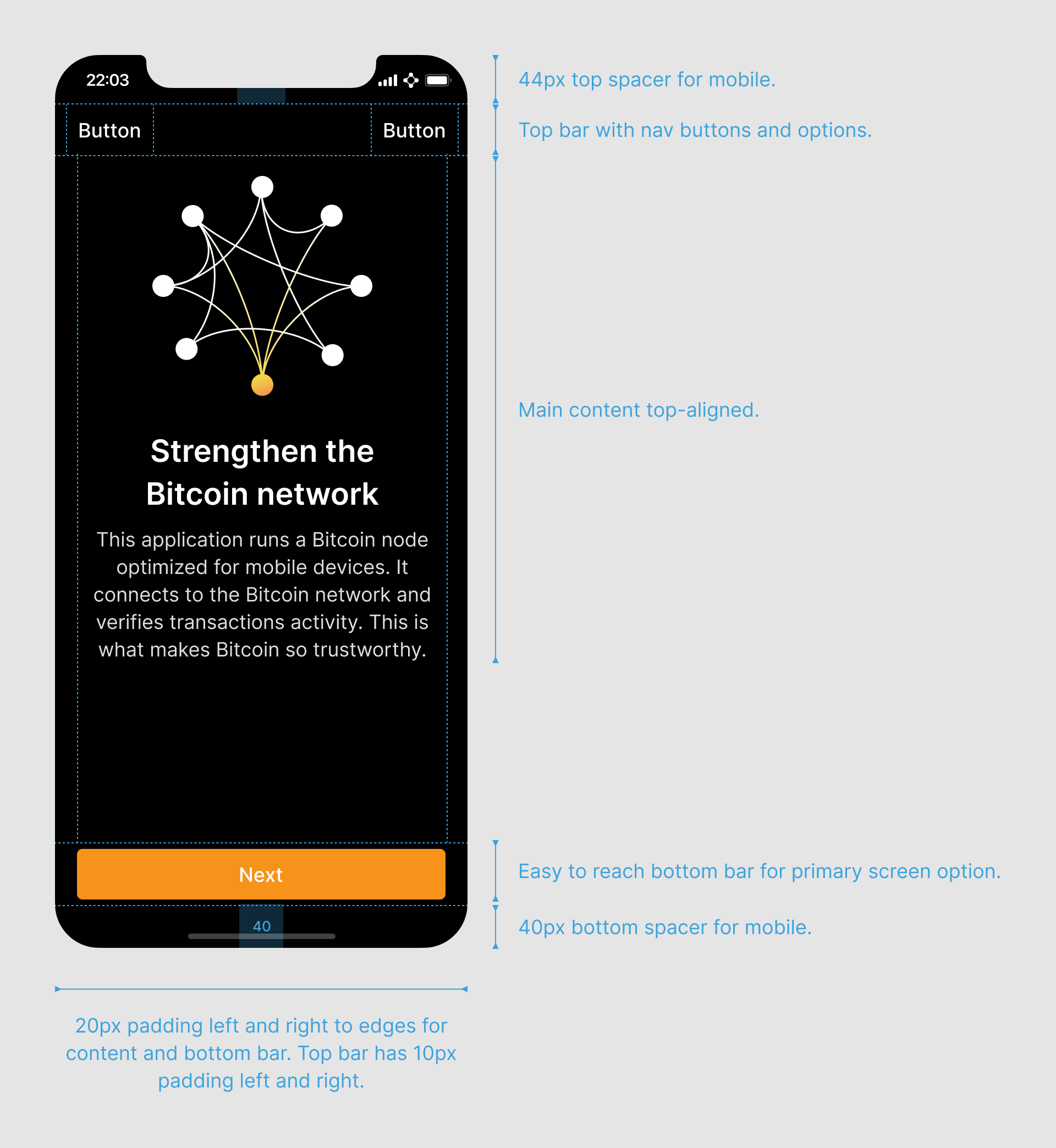
Layout rules slightly differ on mobile since applications are always full-screen and slightl overlap with the status bar and home button on iOS, with slight differences on Android. The primary action is fixed to the bottom of the screen on mobile, to make it easier to access during one-handed use.
Examples of the sticky layout on mobile.