Milestone 1.2: Navigation
Status: Complete
Design milestone, Code milestone, Figma
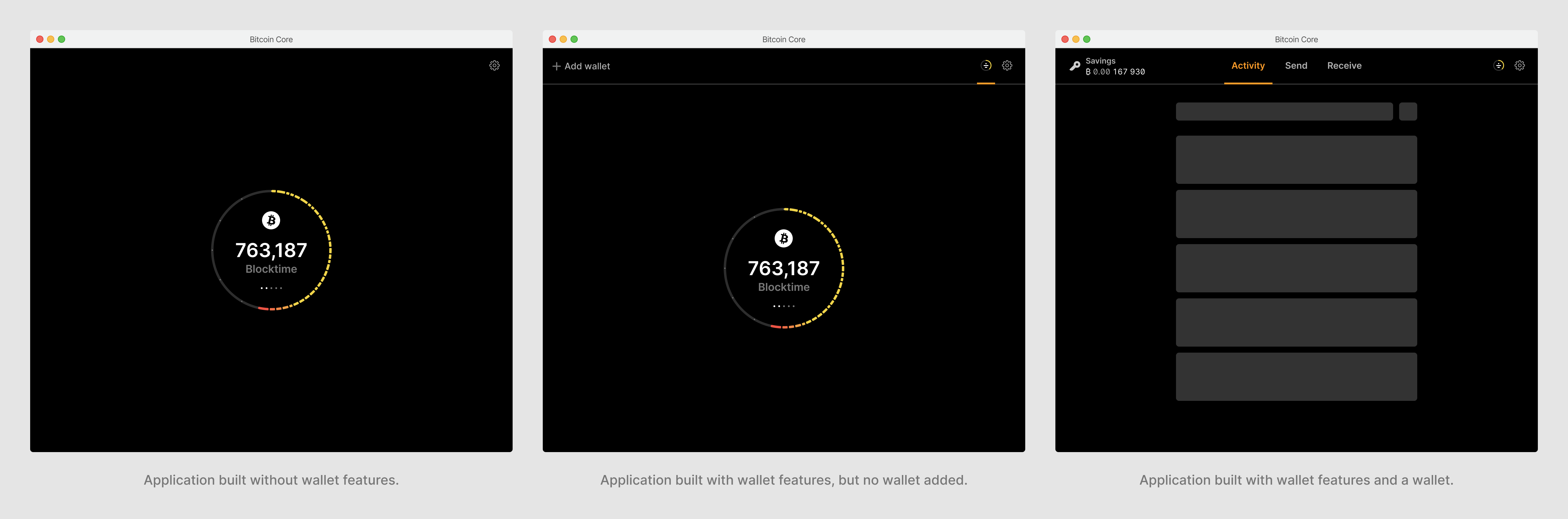
The application flow in Milestone 1 is very simple. After a mostly linear onboarding flow, the user lands on the block status. They can navigate into settings, and back.
In the future, the application will be more complex. There will be new distinct areas for viewing activity, sending, and receiving, each with sub-pages, nested user flows, modals, and more.
Goal with this milestone is to restructure the application, focusing on navigation. We can add empty placedholders for all new screens, only containing essential navigation components.
A central part of this will be the new navigation bars, which will differ in look and behavior across desktop and mobile.
One of the consideration is that the application can be built without wallet features, or a user may choose to only use the node features. In the first case, the UI will skip anything related to the wallet. In the second case, the node will be the primary focus point, with a subtle option to add a wallet.
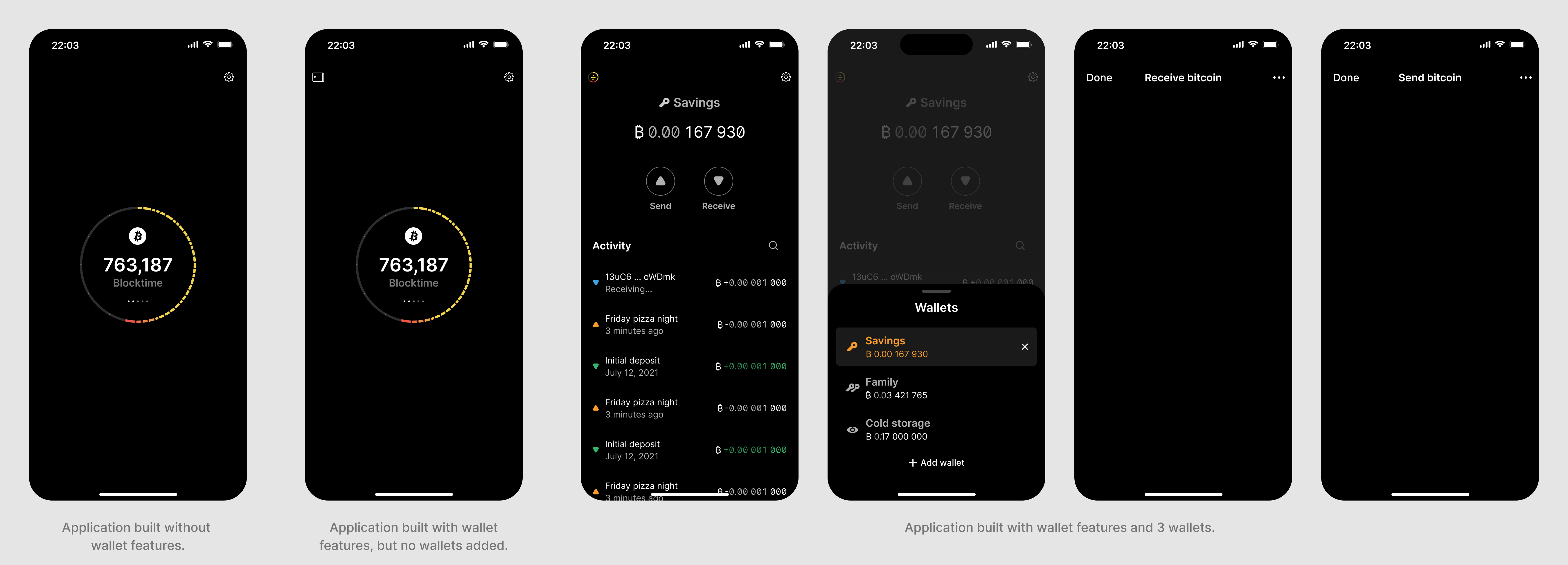
The same states are required on mobile, along with other layout differences to account for the different form factor, interaction model and user needs.
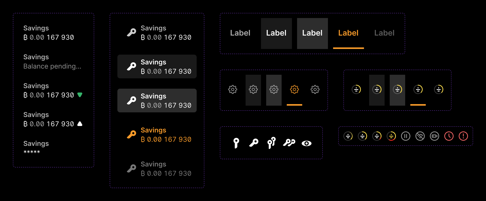
Below are the various interactive states of elements in the navigation bar on desktop.
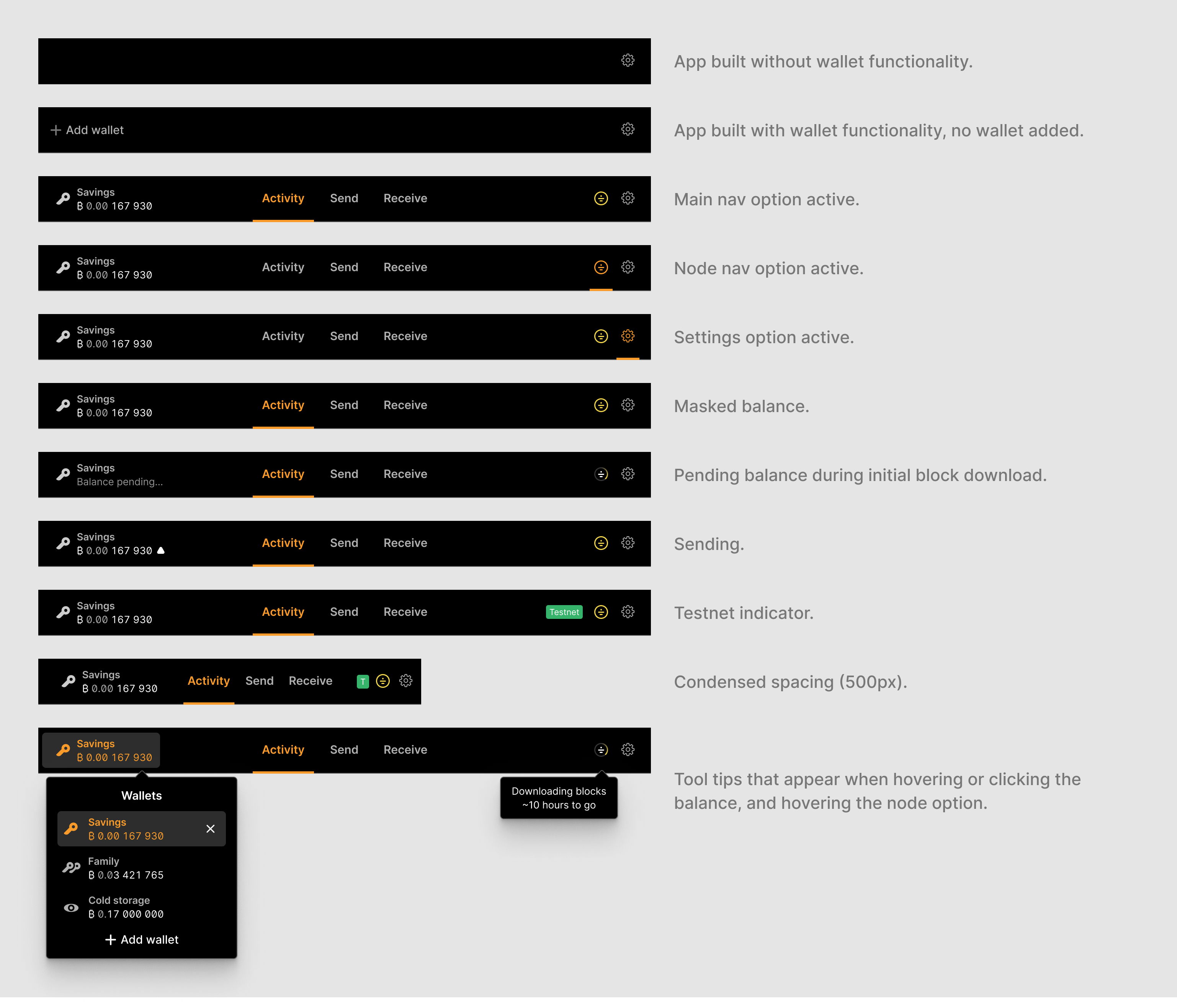
The wallet selector differs across device types. While the content is identical, it appears as a dropdown on desktop, and a modal that slides up from the bottom on mobile. On desktop, the ellipsis (…) button for each wallet item is only visible when hovering the respective item. Since there is no hover interaction on touch devices, that button is always visible on mobile.
On the technical side, the wallet name is the same as the file name. For closed wallets, we have no further information and cannot show wallet type or balance.
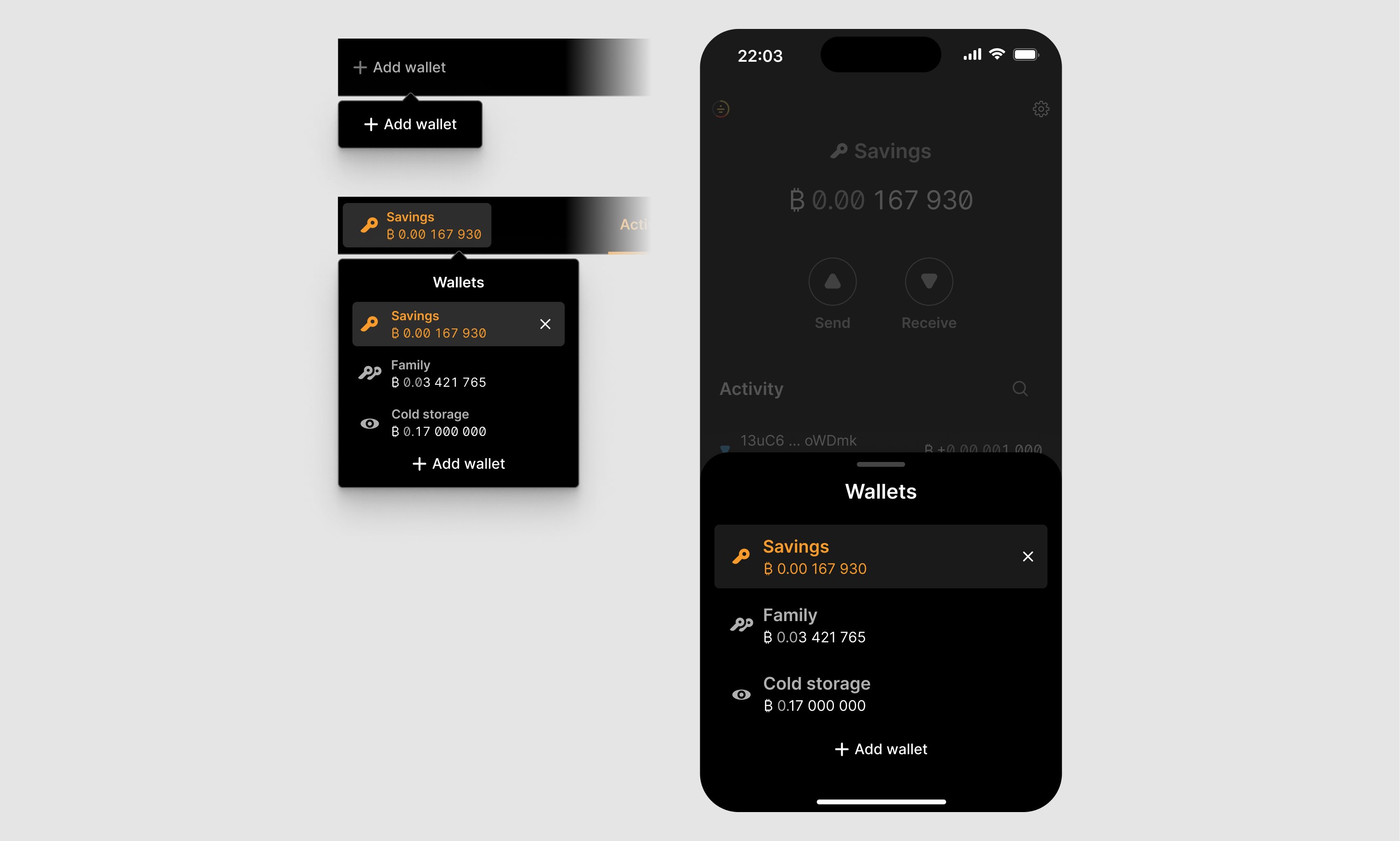
Below are variations of the selector with different amounts of wallets. The list is sorted by the time each wallet as last opened, and becomes scrollable when there are more than ten wallets. The cut-off is so that the eleventh item is half cut-off. This allows users to understand the scoll logic. A light scroll bar indicator appears on the right side when scrolling to indicate the scroll position (and ratio of scrollable content height to the height of the visible window).
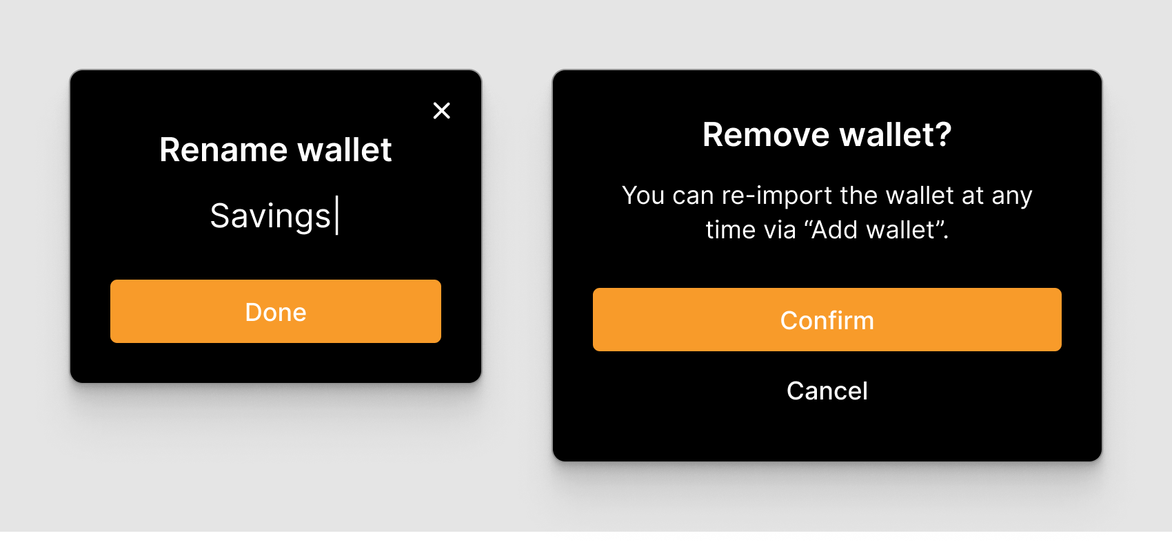
Renaming and removing wallets opens a modal. In the former case for entering a new name, in the latter for confirming the removal and informing users about how to re-add it later.
When a wallet is closed (= no wallet is open), the application navigates to the block status screen. The tabs are no longer visible, and the user has to open one of their wallets for them to appear again.
Below are interactive states of many of the individual elements. For all the visual details, see the Figma file linked above.
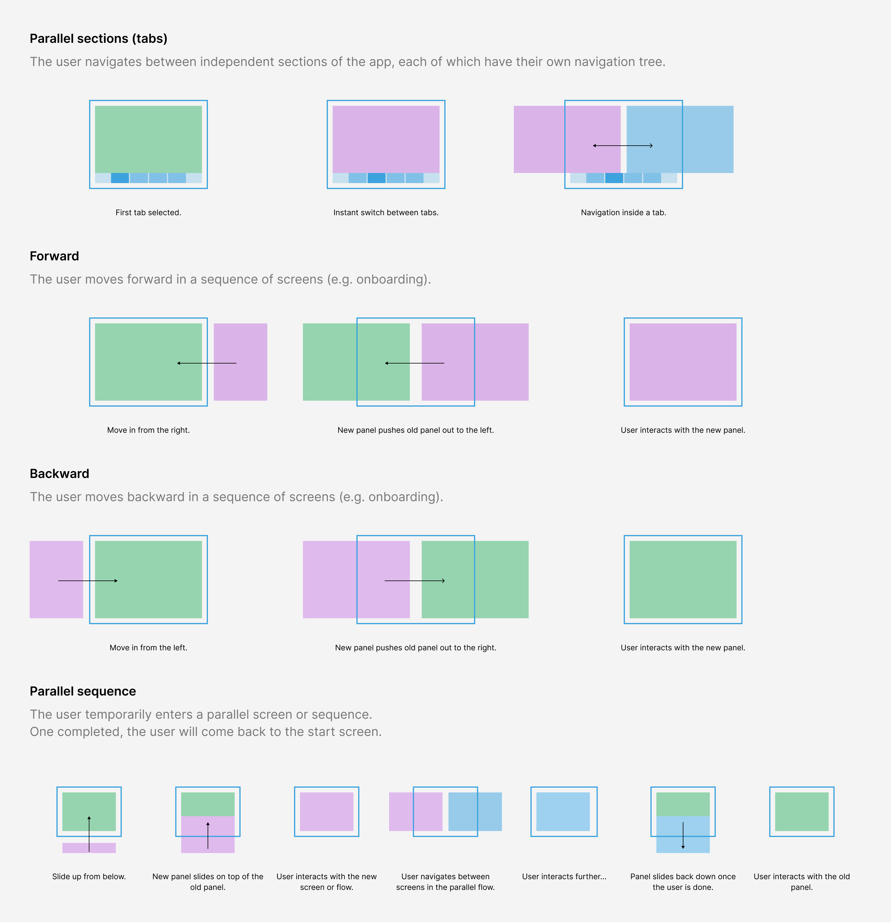
Another aspect is to implement navigation and transition patterns that are intuitive and consistent (in that order). Below are some basic patterns, most of which are already implemented in the application.
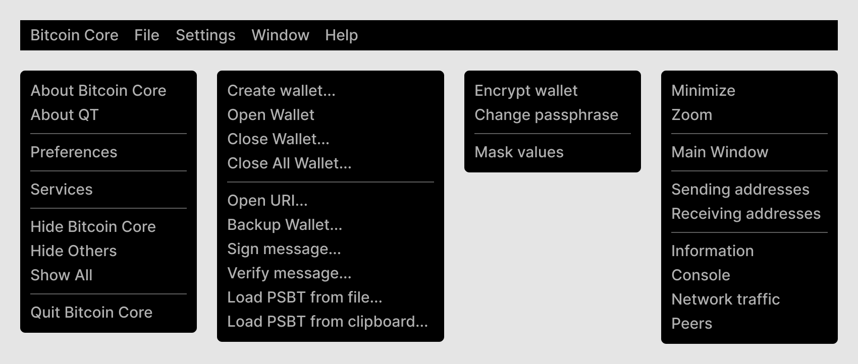
On desktop, users can also directly access various options through the application menu, which are slightly different across operating systems. Below is a first mock-up based on the existing QT application. We will refine these as we work through the remaining milestones as we detail the other features.
Everything on this page is a work-in-progress.
Related & archived